

Who we are
What we do
Photo Gallery

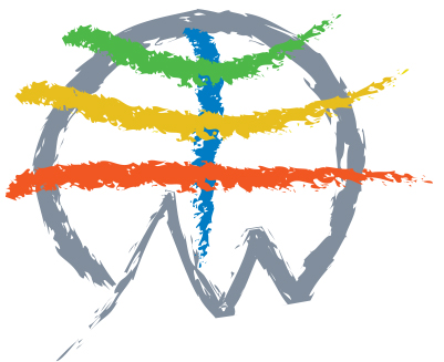


The meaning of the symbol of the Um Hong Gil Human Foundation
As an image of a mountain that symbolizes the Earth and nature the human lives being united into one, it has expressed the natural love, human love and spirit of win-win and expressed the unyielding challenge spirit through the powerful brushed image. Of the colors of expressing the Earth, the red is passion for volunteering, the yellow the passion for humans, the green the love for nature and the light blue is the respect for the sky. The symbol and logo design was produced by executive director Jeon Hong, former adjunct professor at Department of Industrial Design, Sungshin Women's University.

Color System
GRAY COLOR
R129 G142 B157#818e9d
GREEN COLOR
R77 G184 B72#4db848
YELLOW COLOR
R231 G190 B29#e7be1d
ORANGE COLOR
R241 G87 B34#f15722
BLUE COLOR
R0 G124 B196#007cc4

Um Hong Gil Human Foundation Lee jae hoo : Representative
(03049) 3F Sangjin Bldg., 5, Samcheongro9-gil, Jongno-gu, Seoul, Republic of Korea
Tel : 02- 736-8850Fax : 02-736-8858E-mail : uhfg8848@hanmail.net
Copyright ⓒ 2019. UM HONG GIL HUMAN FOUNDATION. All Rights Reserved.


